«Back ·
Tracking: {
'Country Code': 'US',
'Language Code': 'EN-US',
'Email Hash': 'unknown',
'Vendor User Id': 'unknown',
'Vendor Id': 'unknown',
'Customer Type': '',
'Offer Code FONT Download


 Designer:
 Kostas Bartsokas
Publisher: Intelligent Design
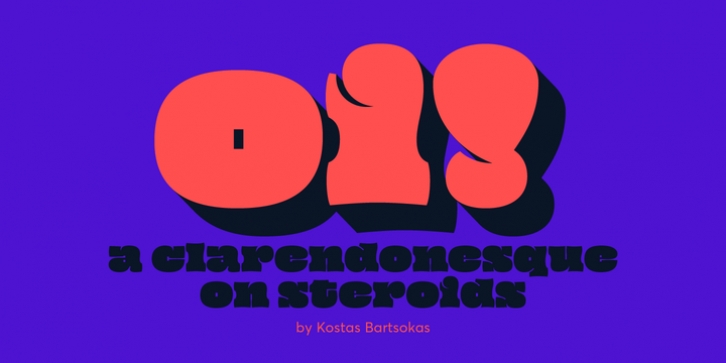
Oi! is an ultra-fat display typeface that has its roots in grotesque slab serifs, most specifically the style that sprung with the release of Caslon's Ionic in 1844 and Clarendon by Fann Street Foundry in 1845. But Oi! is a free spirited twisted interpetation of the clarendonesques. With an unapologetic tendecy for public shouting, it is a whimsical loudmouth attention seeker!
Its letters occupy as much space as possible, bulging sometimes dangerously close to explosion. Ascenders and descenders are minute compared to the ridiculously tall x-height, and the bracketed serifs just a memory of themselves. Closed counters become plain rectangles, open counters tend to transform to thin lines, the occasional ball terminals nod playfully to their ancestors, while accents and diacritics squeeze themselves onto the letters, merging into unique new shapes.
Oi! supports Latin and Greek and comes in two styles. Oi! You!, the regular style, and its accompanying Oi! Mate!, a shadowed style that adds a third dimension to its playfulness.


 Oi! is an ultra-fat display typeface that has its roots in grotesque slab serifs, most specifically the style that sprung with the release of Caslon's Ionic in 1844 and Clarendon by Fann Street Foundry in 1845. But Oi! is a free spirited twisted interpetation of the clarendonesques. With an unapologetic tendecy for public shouting, it is a whimsical loudmouth attention seeker!
